University Logos
Logos Connect Us
East Texas A&M logos create continuity for past generations, future alumni, and the university community. Our logos are used in a variety of situations to support our brand.
Our logos are a powerful way for us to communicate our brand to the world. With that in mind, we provide a variety of options that create a consistent look while allowing for flexibility in the orientation, size, color and presentation of our university’s name.
While this institution has undergone significant changes over the decades, our identity as Lions has remained for more than 100 years. The incorporation of the lion head in the logos is a visual representation of this fact, creating continuity for past generations and future alumni.
Guidelines for Usage
- Use the full-color version whenever possible.
- Do not modify the logo
- Logos must not be altered in any way, including resizing, changing colors, or adding/removing elements.
- Consider color and contrast
- Ensure there is sufficient contrast between the logo and its background for clear visibility.
Do not use a gold lion head on a white background.

Doing so causes the eye, nose, mouth, ear and jawline to become highlights instead of shadows. This isn't how actual lions look.
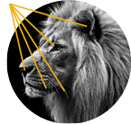
These areas have a natural darkness which forms the curves and dimensions of the face.

It creates a lack of definition and contrast, leading to a glow-like effect. This can also cause the lion to appear like a serpent.
Contrast is a serious issue. For example, ADA-compliant text must have a contrast ratio of 4.5:1. The contrast ratio between gold and white is only 1.6:1. This lack of contrast could make it hard for those with a visual impairment to see the details of the face.
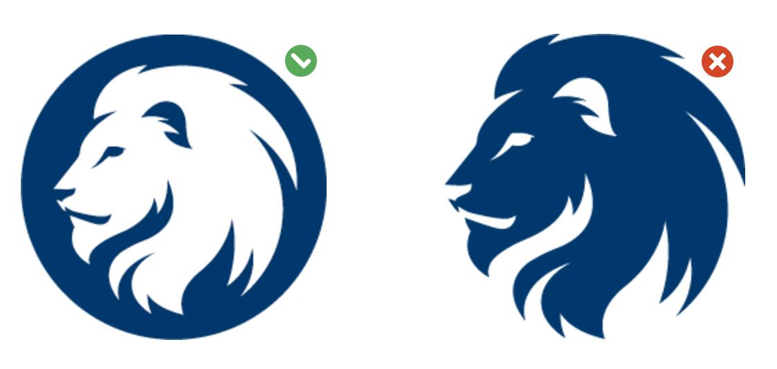
- The lion must always appear lighter than the background. This means the lion will never appear blue or black on a lighter background. Use the version with a solid dark circle around the lion instead.
- Respect the Logo Composition
- Do not remove the lion from the circle.
- Do not stretch, squish, or distort the logos.
- Leave clear space around the logo – Avoid placing a logo right next to other design elements. Leave enough space around the logo to ensure it appears clearly separate from other graphics.
Logo Files
The East Texas A&M University logos are protected assets. To maintain consistency and integrity, they must be used in accordance with official branding guidelines.
Note: For best results, unzip the file on your local drive.
Logo Use Guidelines
East Texas A&M logos and names are owned by the university and The Texas A&M University System. They are legally registered in and protected by the U.S. Patent and Trademark Office. Please review the following guidelines for information on how to correctly use the university's names and logos.
The following university names and logos are legally registered in and protected by the U.S. Patent and Trademark Office, so the registered symbol (®) must accompany them:
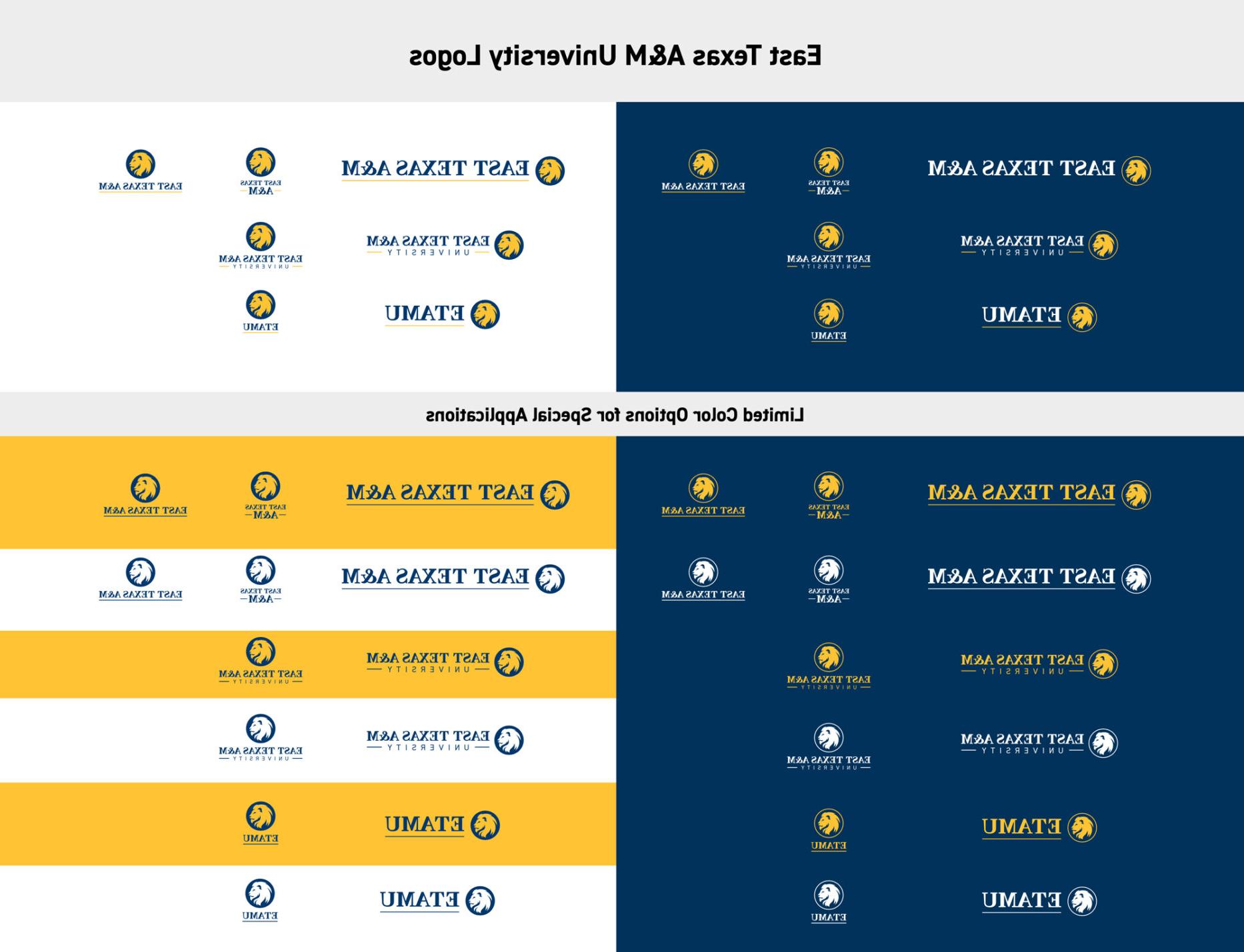
Stacked Full Name Logo
Vertical East Texas A&M Logo
Lion Head Logo Mark
Full University Name
The registered symbol may be omitted if:
- It distracts significantly from the logo within a design.
- It is too small to be readable.
- The logo is used for internal purposes at East Texas A&M.
Sizing the Registered Symbol
- Maximum Size: The maximum size of the registered symbol is equal to the height of the serif on the letter “E” in the logo.
- Minimum Size: The registered symbol must remain large enough to be legible.
Please reach out to the Office of Marketing and Communications at [email protected] if you have questions about when or how to use the registered symbol.
Registered East Texas A&M names and logos may only be used:
- By official university vendors.
- By East Texas A&M employees or students in affiliation with official university programs, groups and organizations or for university-approved activities.
- In association with content that aligns with the university's values. References to drugs, alcohol and other inappropriate content are not permitted.
The Office of Marketing and Communications must review all items that include the university logo to ensure proper use. Send artwork to [email protected] for review and approval.
Please review the university's policy regarding Licensing and Use of University Names, Logos, and Trademarks.
- Stacked full name: most versatile; works for a variety of situations and audiences
- One line full name: great for applications where space is thin and long, such as pens and banners
- One line East Texas A&M: great for applications where space is thin and long, such as pens and banners
- Vertical East Texas A&M: most versatile; works for a variety of situations and audiences
- Horizontal ETAMU: best for informal uses such as student organizations
- Vertical ETAMU: best for informal uses such as student organizations
- Use the two-color version whenever possible.
- Choose the version that creates the most contrast between the background and the logo.
- The lion head should always be lighter than its background.
- Printing in color: Use the two-color CMYK version.
- Printing in black and white: Use the one-color version in black or white depending on the background color.
- Limited budget: Use the one-color PMS logo.
Lion Head Color
Do not use a gold lion head on a white background.
Doing so causes eye, nose, mouth, ear and jawline to become highlights instead of shadows. This isn't how actual lions look.
These areas have a natural darkness which forms the curves and dimensions of the face.
It creates a lack of definition and contrast leading to a glow-like effect. This can also cause the lion to appear like a serpent.
Contrast is a serious issue. For example, ADA compliant text must have a contrast ratio of 4.5:1. The contrast ratio between gold and white is 1.87:1. This lack of contrast could make it hard for those with a visual impairment to see the details of the face.


Special Circumstances
The Office of Marketing and Communications reserves the right to alter the logo color under special circumstances or for unique situations, such as a breast cancer awareness campaign.
The logo's background should be carefully and thoughtfully chosen. Make sure that it maintains the proper amount of contrast for readability. Do not place the logo over busy images, patterns or backgrounds.
To ensure legibility, logos must not be reduced beyond the following defined minimum size:
Digital
For screen displays, logos should never appear smaller than 120 pixels wide (stacked full name) and 60 pixels wide (vertical East Texas A&M).
Print
Logos should not be printed smaller than the following:
Do not overuse the logo.
Do not replace letters with the logo.

The only exception to this is in the word “Lion(s).”

Up Next
Explore our brands
Contact Us
- Office of Marketing and Communications
- 903.886.5127
- [email protected]
- Binnion Hall, 140
- 1500 Education Drive
- Commerce, TX 75428